Len Reynolds Trust Vertical LogoLen Reynolds Trust Vertical Logo - PNG file for community groups and organisations to download and use.
Len Reynolds Trust Logos
The Len Reynolds Trust logos are available for use by community groups that receive funding support from the Trust. These logos help acknowledge the Trust’s contribution and reinforce our commitment to supporting community-led initiatives that align with our strategic priorities.
Both vertical and horizontal versions of the Len Reynolds Trust logos are provided in PNG format to ensure flexibility in various digital and print materials. To maintain consistency and integrity, users need to follow the Trust’s identity guidelines, which outline correct usage, colour specifications, and placement rules.
Brand Guidelines
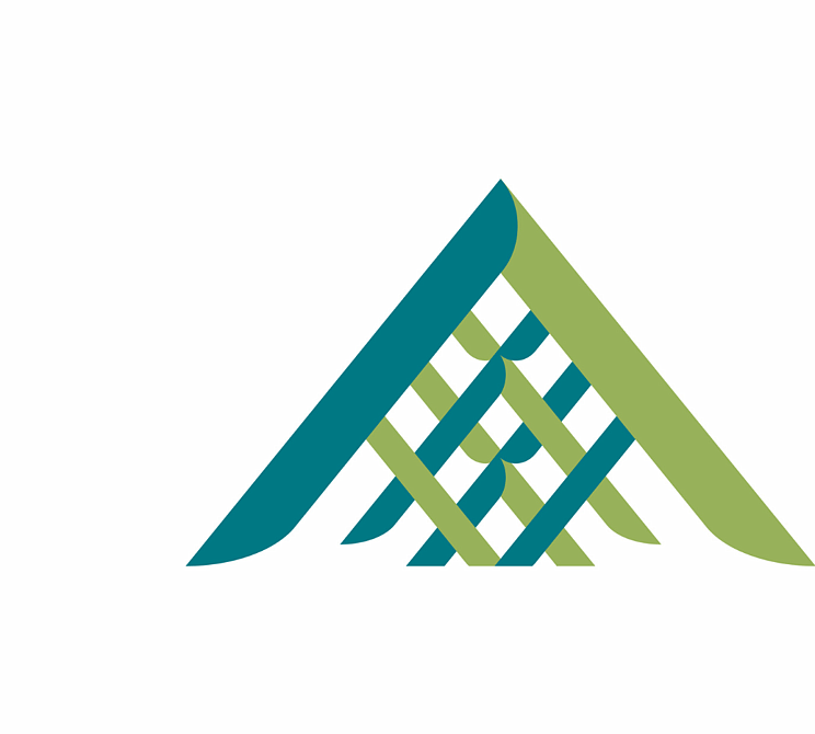
At the heart of our brand is the interwoven tohu, inspired by raranga, which symbolises the deep interconnectedness of people and the environment.
The harakeke represents growth and life, while the weaving integrates the symbolism of the maunga and awa, visually expressing the bond between generations, intergenerational well-being, and the enduring relationship between people and their surroundings. From a bird’s-eye view, the design can also evoke the image of a manu or whai, reinforcing our connection to nature, culture, and identity.
Please read through these brand guidelines which provide detailed instructions on the appropriate use of the tohu, colours, typography, and logo variations to ensure a unified and meaningful representation across all communications.
Logos to Download
Len Reynolds Trust Horizontal LogoLen Reynolds Trust Horizontal Logo - PNG file for community groups and organisations to download and use.